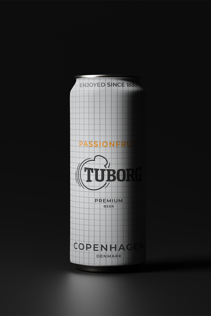
The goal of this project was to design a brand experience that allows Tuborg to actively release young people from negative pressure. A key touchpoint for this brief was packaging , as well as the development of a space and experience where Tuborg’s audience can truly feel liberated, embrace spontaneity, and fuel their fun.
Young people are constantly under pressure to perform, conform, and deliver.
Tuborg believes they Don’t Have To.
Studies show that social media is amplifying feelings of anxiety, inadequacy, and fragmented social identities in Gen Z, so I wanted to create a space which would disconnect Tuborg’s audience from this. Further research showed that whilst beer remains the most popular alcoholic drink among older generations in the UK, cocktails are more popular among Gen Z by 26%. Market analysis suggested that striking visual appeal and a sense of novelty is a winning formula for high quality products.
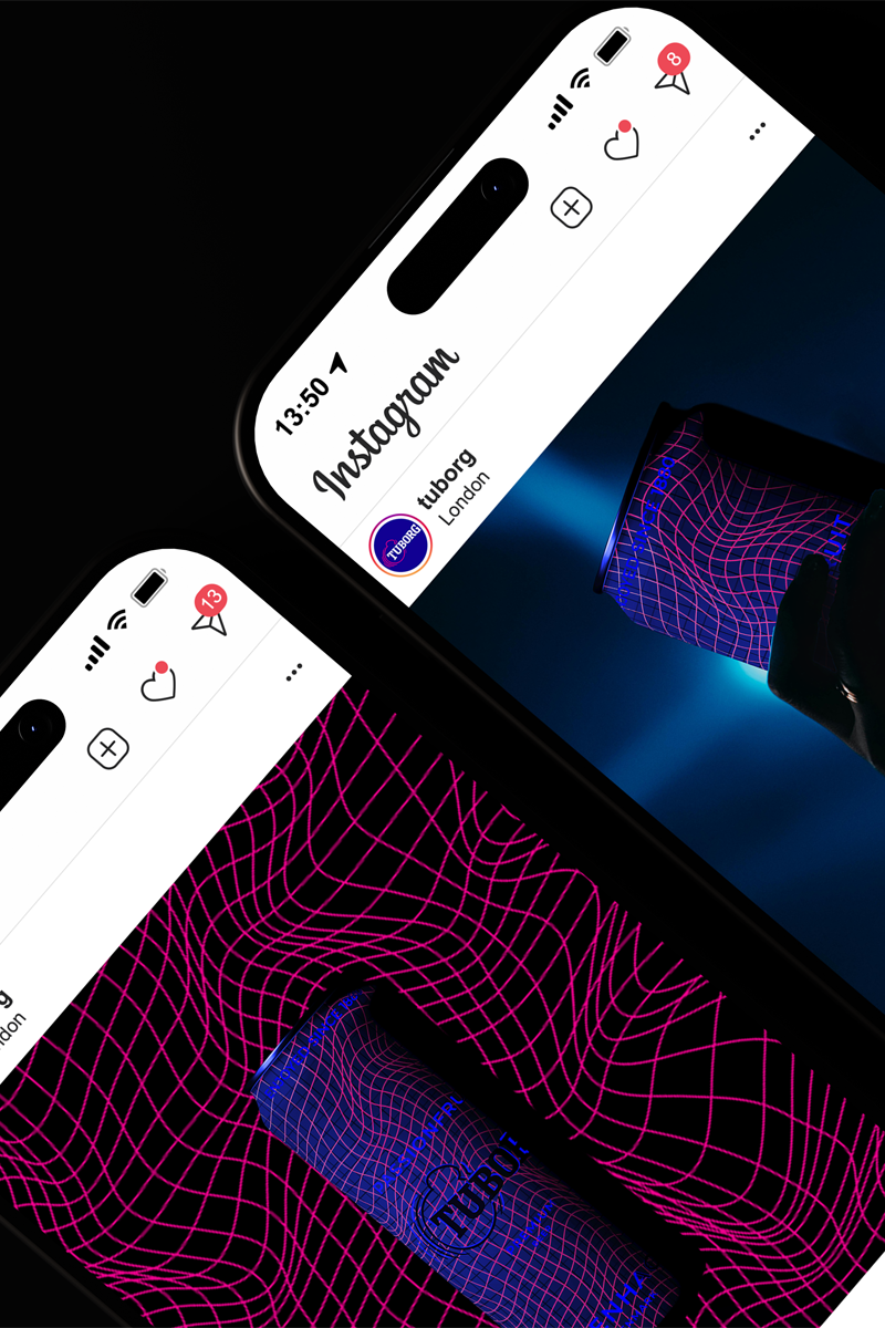
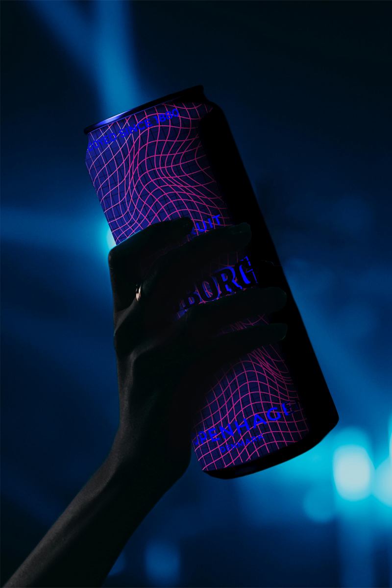
To encourage young people to break free, I designed Tuborg’s ‘Pressure Drop’ campaign. Taking over London nightclubs, the campaign creates spaces where people can feel truly liberated, and enjoy themselves in their own way. The range of bold new flavours are directly targeted towards Gen Z, with the can design hiding a hidden twist.
The campaign allows Tuborg to connect more closely with its younger audience, and creates a genuine disconnect from social pressure by encouraging more present offline social moments.
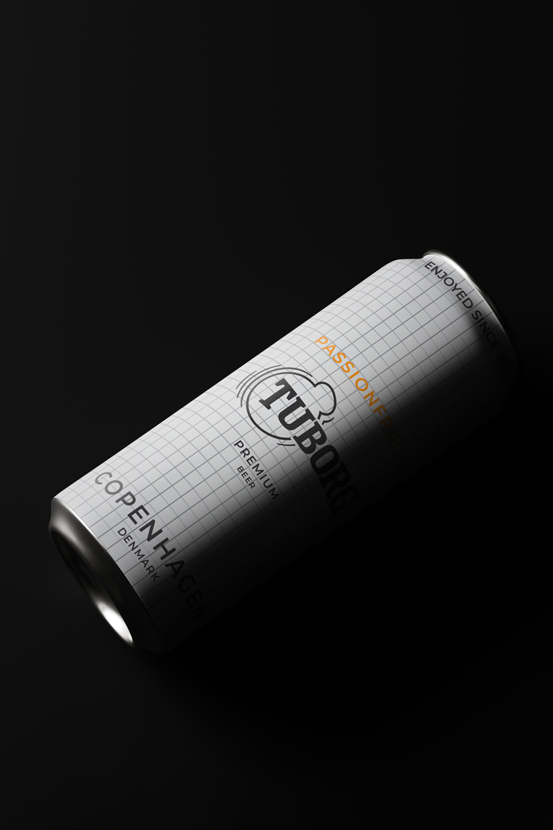
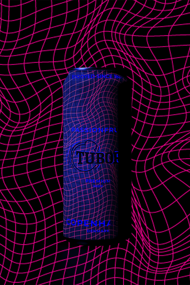
The hidden design of the ‘Pressure Drop’ cans is revealed under UV light, making the product appear striking in a nightclub environment. Embodying Tuborg’s bold and disruptive spirit, the design challenges the expectation of perfection. The design of the cans reflects the demands to conform in everyday life, using a rigid grid system and minimal colour palette to represent restriction and uniformity. Under UV light, the design breaks free from this system, visually representing a release from societal pressure and freedom to exist without constraints.

To help people decompress and express their authentic selves Tuborg is turning London nightclubs into ‘Drop Zones’ which sport various features to facilitate this.
Phone lockers | No pictures or recording so you can dance like no one is watching.
Decompression Lounge | Everyone lets go in different ways, so quieter lounges with soft seating and ambient music allow everyone to decompress their way.
Photo spaces | Designated photo areas allow you to share the fun without disrupting it for others.
‘Pressure Gate’ | Guests pass through an immersive ‘Pressure Gate’ entrance, symbolising the transition into a space where they can release your negative energy.

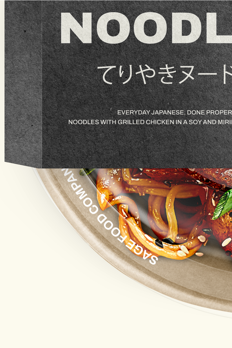
This project aimed to activate a brand which offers premium and authentic Japanese food to the UK market, providing meal kits, delivery services, and in-store products.
Japanese food in the UK is widely represented through simplified, Westernised formats that prioritise speed, novelty, and visual clichés over authenticity. I aimed to create a brand that moved away from overused design tropes, focusing instead on communicating the Sage’s more considered representation of Japanese food culture.
Research into the UK food industry highlighted an increase in demand for convenience alongside higher standards of quality. Consumer behaviour also shows a growing openness to exploring diverse cuisines and less familiar flavours, highlighting a clear gap in the market. Analysis of existing Japanese food brands in the UK market revealed a reliance on stereotypical iconography and design language, leading to the perception of Japanese food as a gimmick rather than an everyday option.
Sage Food Company is a response to the gap in the UK market for credible, everyday Japanese food. It offers convenient meals that are grounded in Japanese culture, unlike oversimplified, westernised, or novelty driven alternatives. The name Sage is derived from Carl Jung’s ‘Sage’ brand archetype, which felt like a natural fit for the brand and also effectively communicated its values of tradition and knowledge rooted in thousands of years of cultural heritage.
Sage is not just a food service; it could reshape the landscape of Japanese food in the UK, redefining how people perceive and engage with the cuisine.
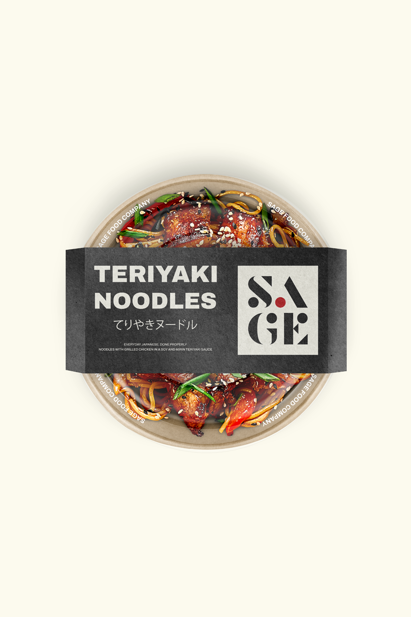

To create the typographic logo, each letter was designed using the golden ratio, to
ensure balance, harmony, and visual stability. The logo is constructed using recurring
geometric forms, which can be applied across various touchpoints to reinforce a
confident and consistent brand identity. Its minimalist design is inspired by the the
concept of ‘Ma’, a Japanese philosophy derived from Zen Buddhism, focused on the
appreciation of negative space. This is expressed through the subtle integration of the
Japanese flag within the logo.



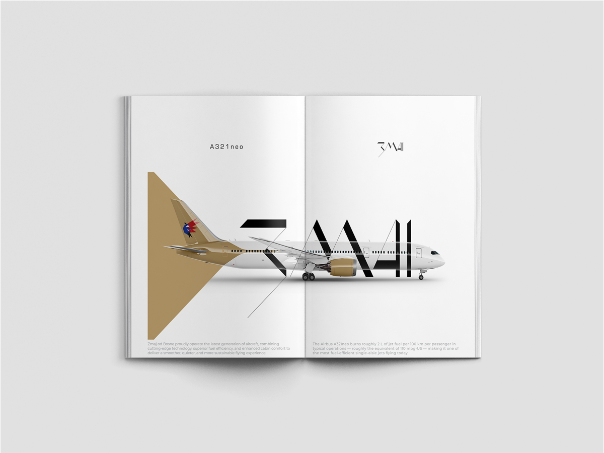
This project aims to create a visual identity for a Bosnia & Herzegovinian concept airline brand. The brand aims to share Bosnia’s rich culture, and build connections around the globe.
Designing a national airline for Bosnia presents the challenge of reshaping the perception of a country which is unfamiliar to most, and still commonly associated with the war of the 1990s. The brand aims to move Bosnia’s global perception forward, shifting focus to its rich culture, heritage, and contemporary identity. The airline is positioned as a symbol of national pride and a connector between Bosnia and the rest of the world.
There is clear evidence of growing international demand for tourism in Bosnia, particularly from Türkiye, the Gulf, and neighbouring regions. My research also showed that international awareness about Bosnia is limited or outdated. Associations with the 1990s war still linger, and there is little understanding of Bosnia’s current identity, culture, and lifestyle.
This project responds to growing interest in Bosnia by using design as a tool to reshape perception and showcase the country’s cultural depth. The brand celebrates Bosnian identity through carefully considered visual decisions, such as the Zmaj wordmark which uses Bosnian Cyrillic, preserving medieval heritage by presenting it in a contemporary context. The name Zmaj is a reference to Bosnia’s national sports teams, know as ‘Dragons’, also carrying a natural association with flight.
Zmaj has the potential to reshape international perceptions of Bosnia, moving beyond outdated associations and positioning it as a culturally rich and contemporary destination.
The Zmaj logo has three main sections to represent each distinct ethnic group in
Bosnia & Herzegovina. The brand celebrates diversity, and its logo represents the
unity of all three groups.


The logo is inspired by the Constructivist design movement, using geometric construction, functional principles, and a minimalist primary colour palette, referencing a visual language that has historical roots in Bosnia’s design heritage. It also applies the golden ratio to create a sense of visual harmony even in the absence of strict symmetry.