

I am a graphic designer focused on bringing culture and history to life through design. I am driven by my love of learning and sharing knowledge with others. I enjoy using photography and traditional image-making to create engaging experiences.

Throughout history, LGBT+ authors and stories have been ridiculed, censored, and denied publishing for writing stories about their love and lived experiences. Despite social and personal consequences, these authors fought to get their voices heard, no matter the century.
However, many of these stories have been separated from the context of their authors’ identities and lives. Therefore, removing vital context from these works

Queer literature is vital for people to feel represented in the material they read, as it helps them form an understanding of their identity and creates community. Furthermore, having these stories visible also gives people outside the community a chance to understand and build empathy. To move forward and make progress, we need to know what came behind us.
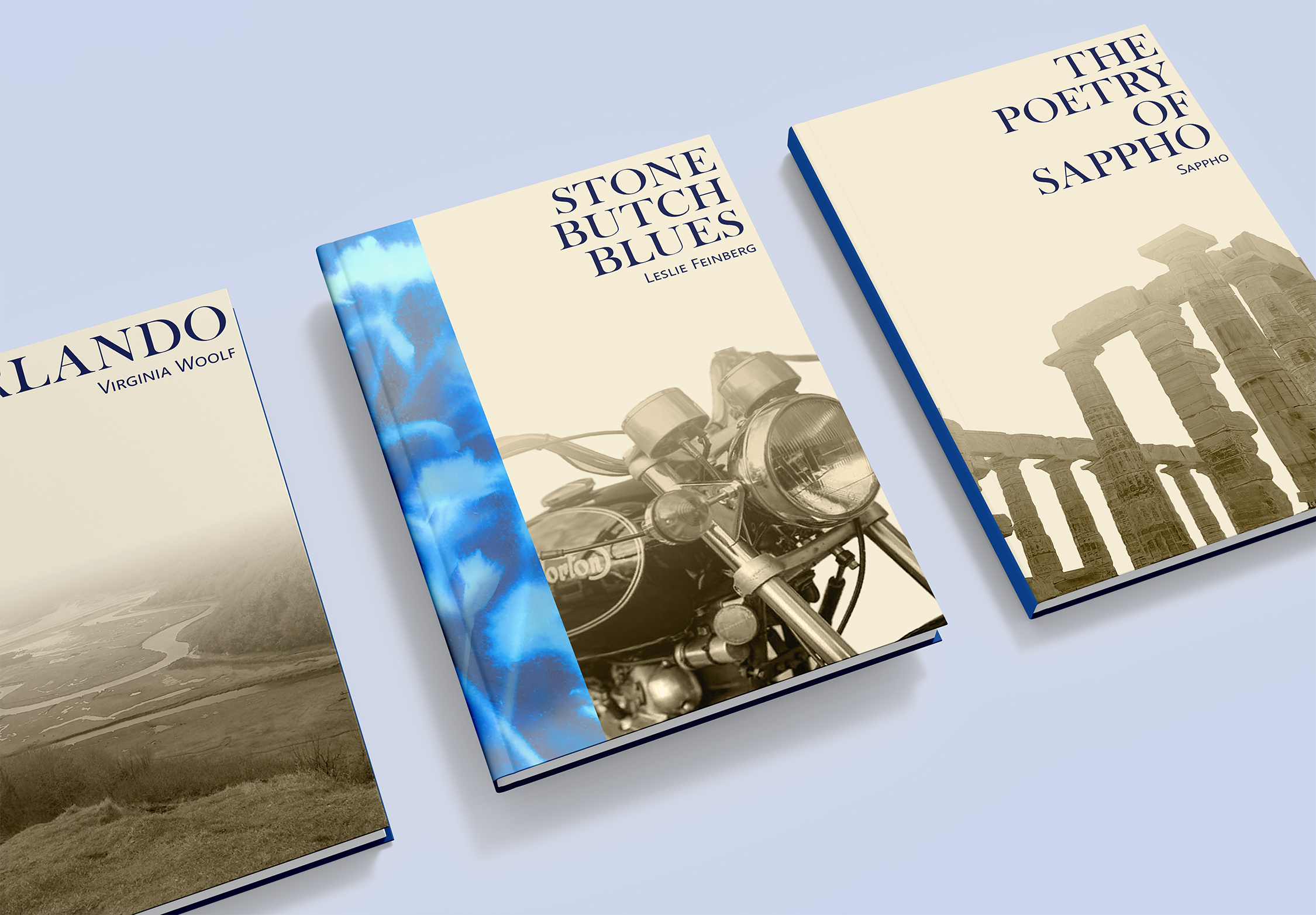
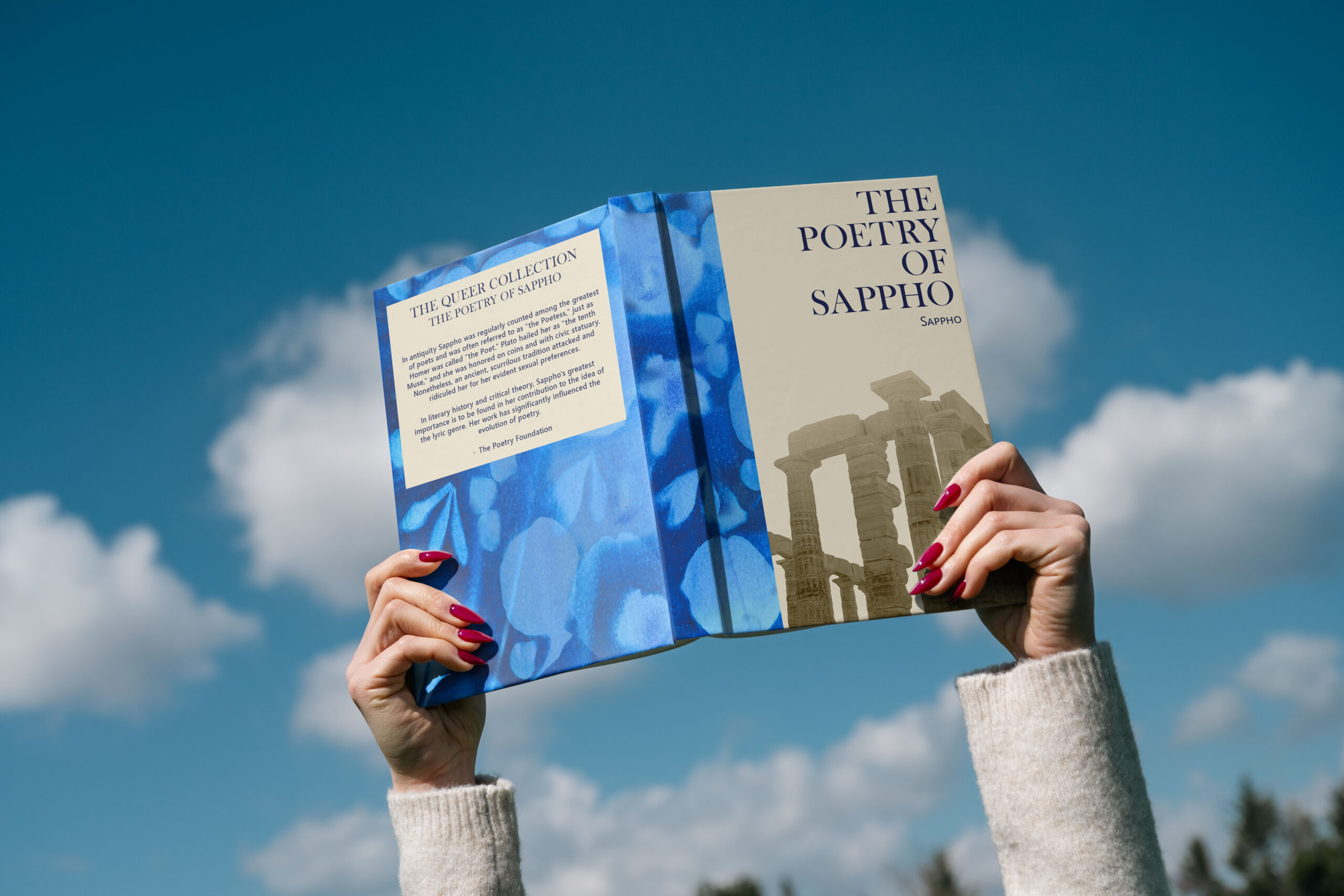
This project proposes a design identity for a book collection that celebrates pivotal LGBT+ literature without erasing the identities of its authors.
These designs aim to create a classic, minimalist feel that complements the written work without distracting from it. This discreet design approach is also for people who might not want or be in a safe place for the usual bright and rainbow designs usually associated with pride collections

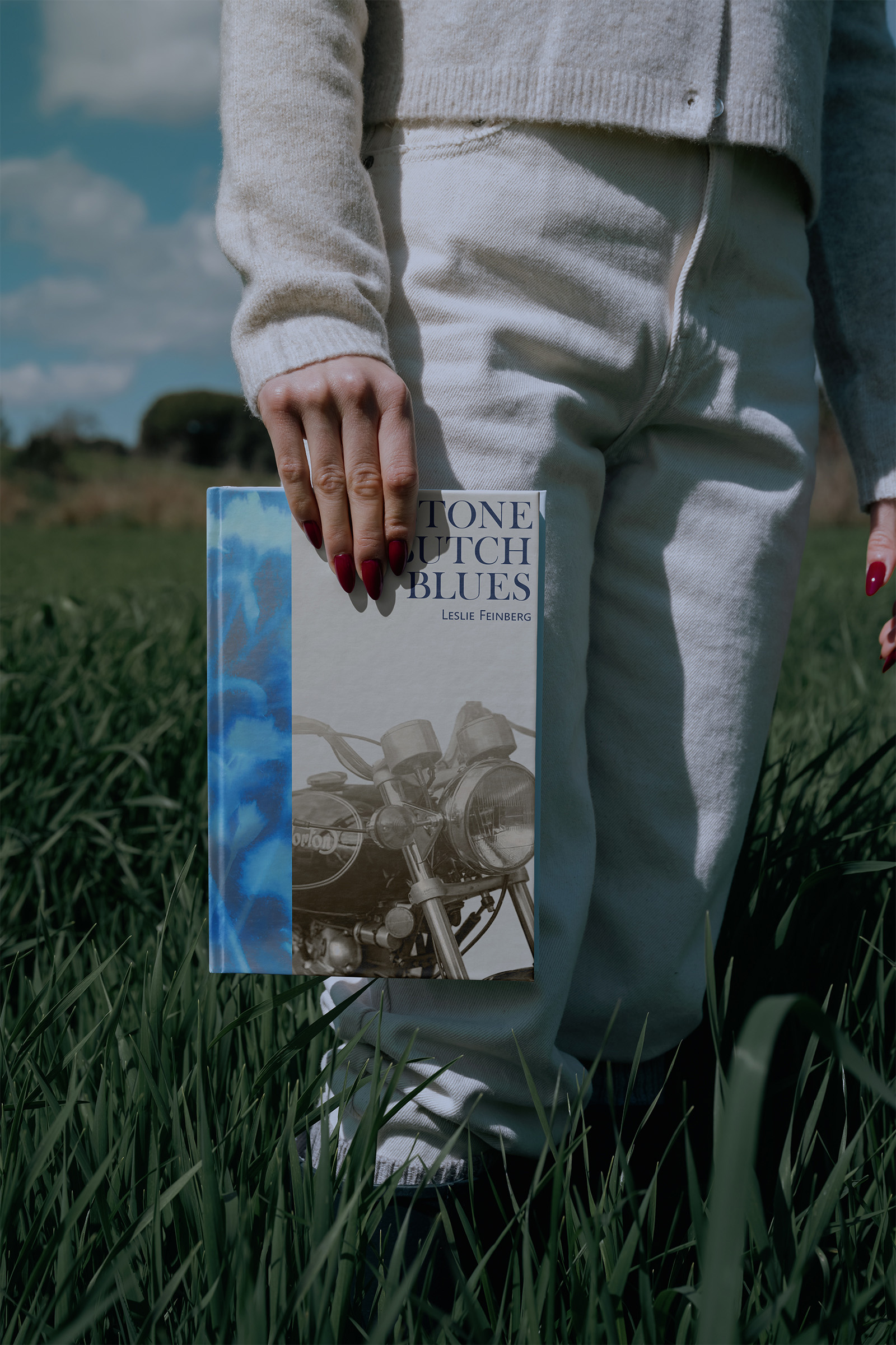

These books would have UV-sensitive covers, and once exposed to the light, they develop a bright blue floral pattern. Symbolising the experience that many LGBT+ people have of self-acceptance, visibility, and living openly in one’s “true colours.”
Welsh history has only been included in schools since 1989. There is a lack of teaching resources, and teachers need training in Welsh history. There needs to be less focus on the dominance of the “British” narrative because it silences non-English histories. This is especially prevalent when it comes to art, as Welsh art either just gets lumped into the general “British” label or artists never receive the support and recognition they deserve because of a lack of funding.
From September 2023, Welsh history must be taught explicitly in the new curriculum for Wales. which enforced the requirement for pupils to be given the “opportunities, where appropriate, in their studies to develop and apply knowledge and understanding of cultural, economic, historical and linguistic characteristics of Wales.” However, areas like art history are being left out of teaching despite the deep link between the country and its art.

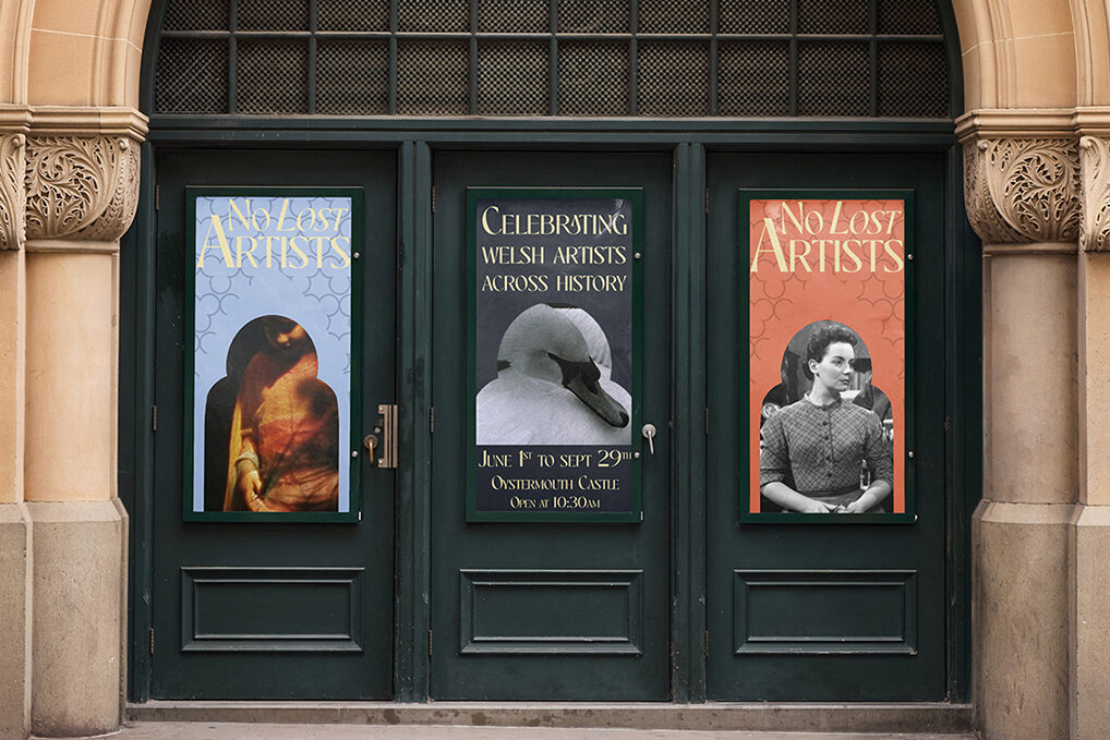

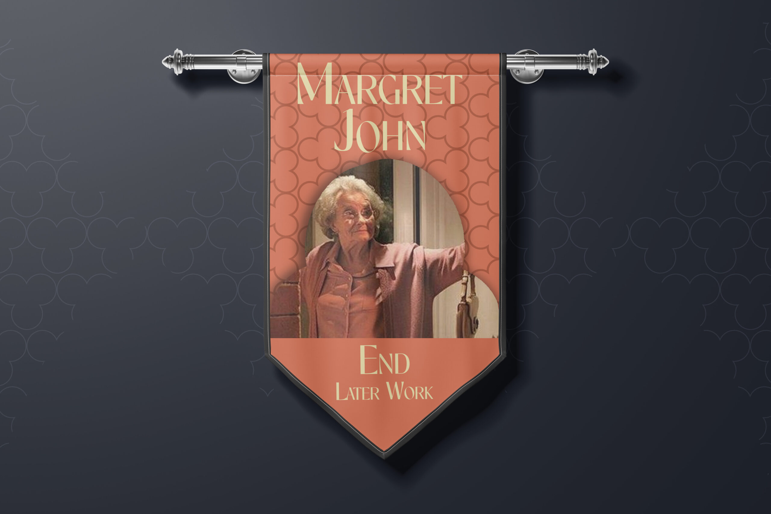
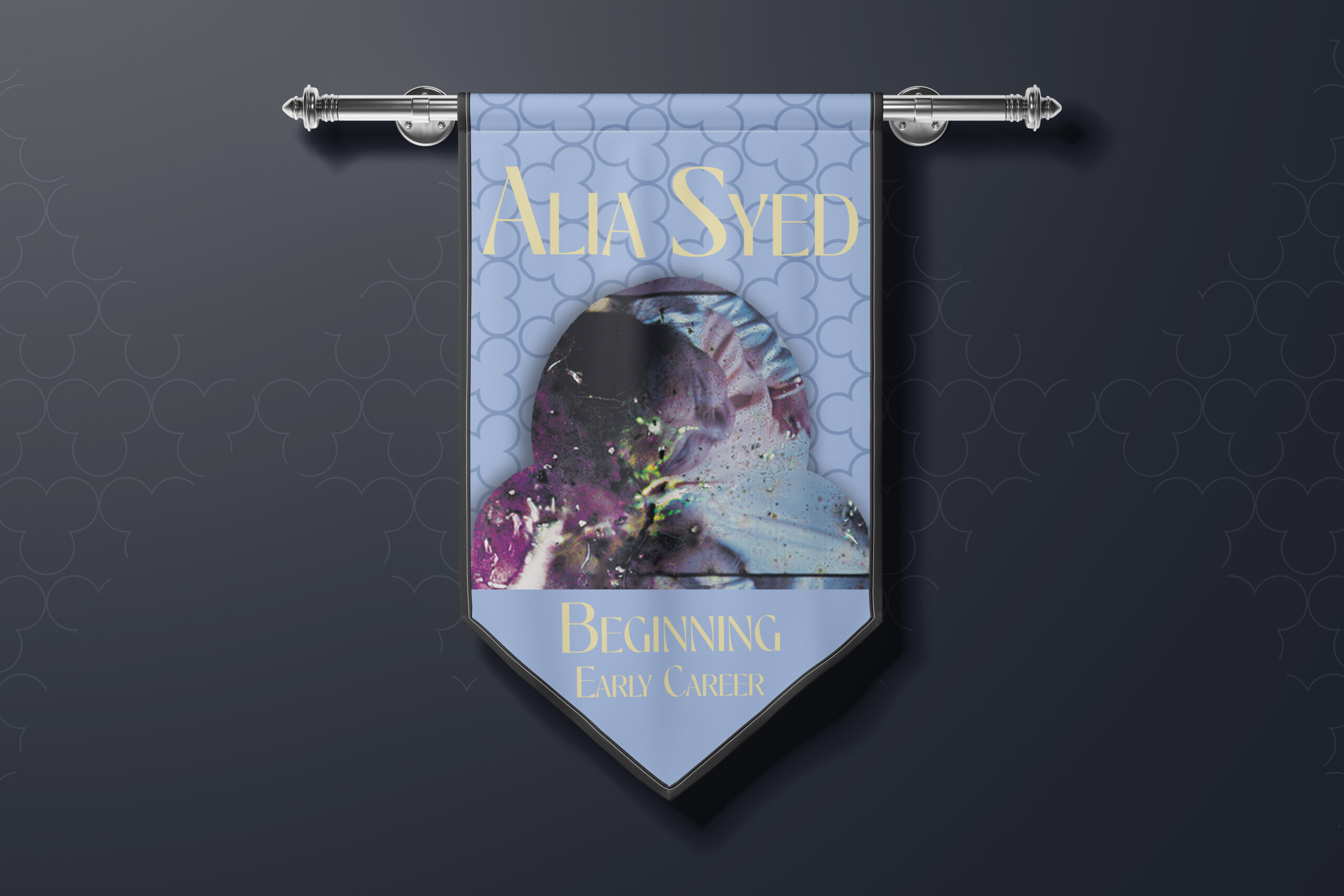
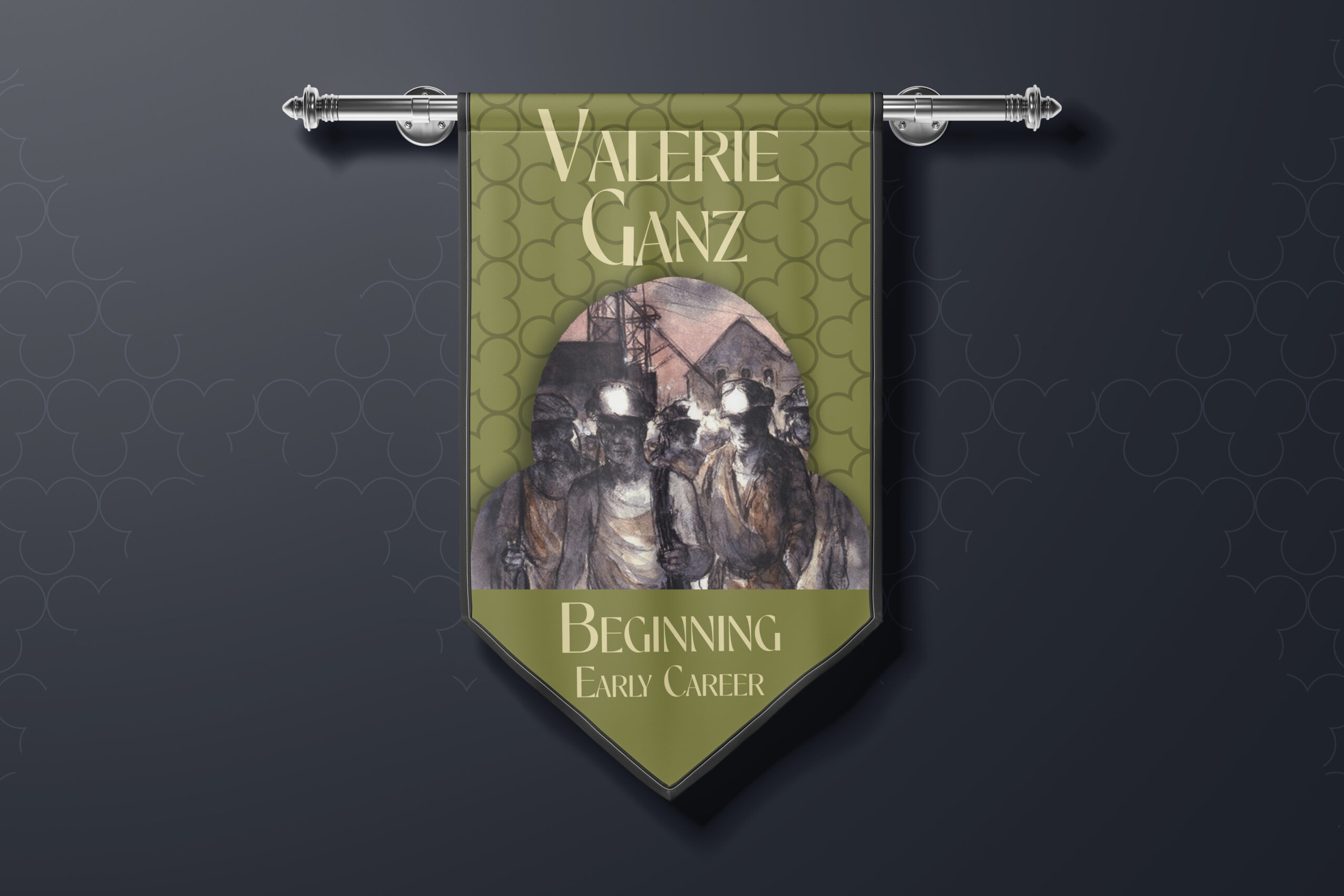
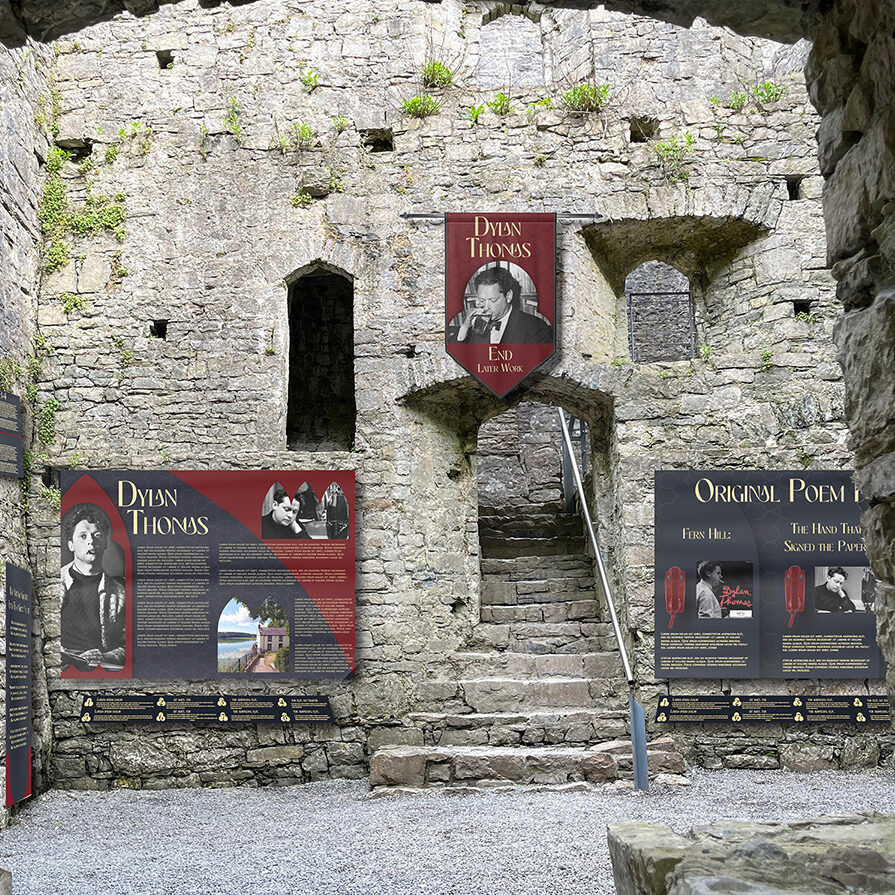
My solution for this was to design an art exhibition that showcases specifically Welsh artists of all different media from across Wales. This exhibit aimed to not only display the art but shine a light on the artist themselves and tell the story of their life throughout their career.
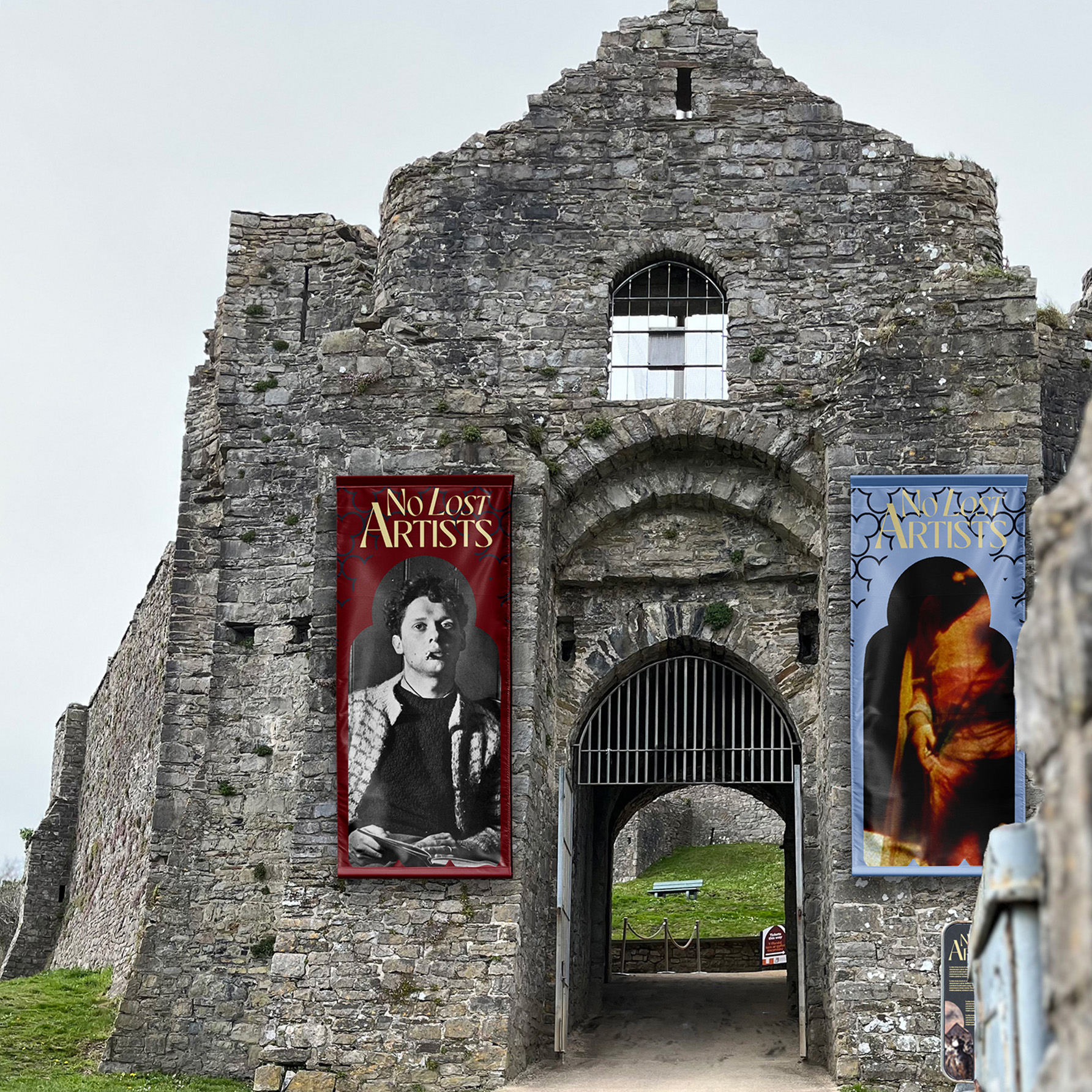
The exhibits would happen throughout the country, within the towns and cities, local castles and monuments. This is to make use of these beautiful monuments, to make it more accessible to locals and to localise each exhibit to include work from artists in that town/ area
Financial education often gets skipped, not because teens don’t need it, but because adults assume they already know it or can learn it themselves. This leads to teens making mistakes while travelling, costing them vital money and confidence. Financial literacy grants freedom and safety, but these skills need to be built from a young age.
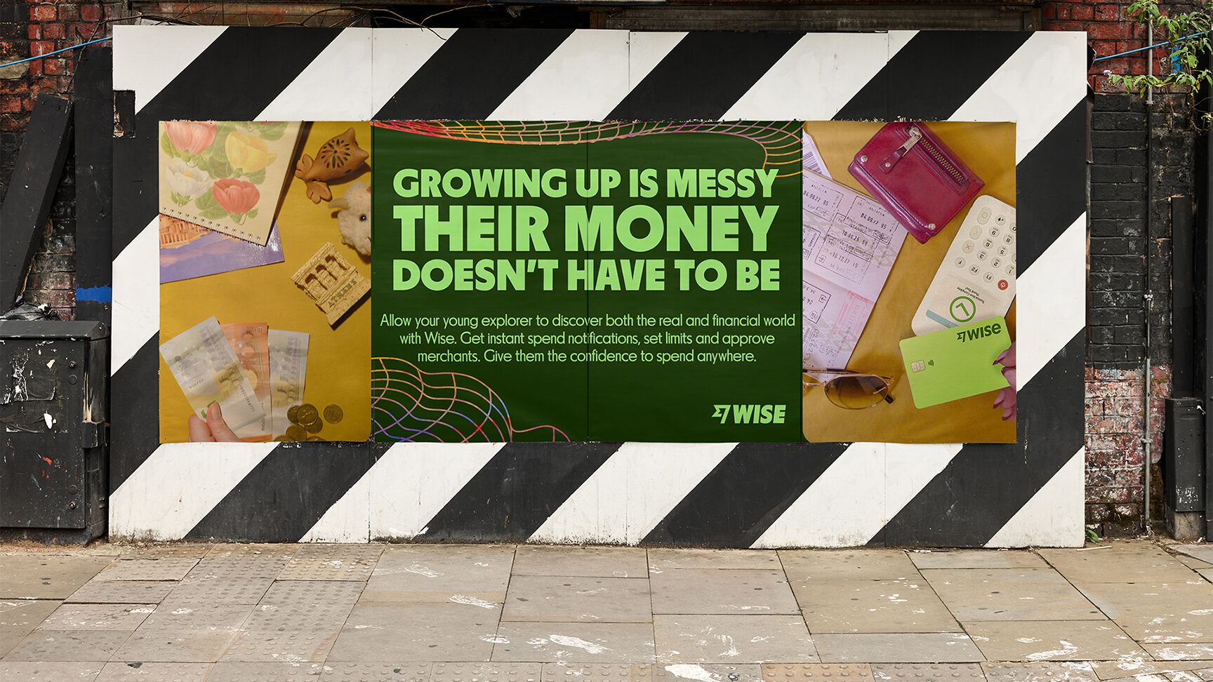
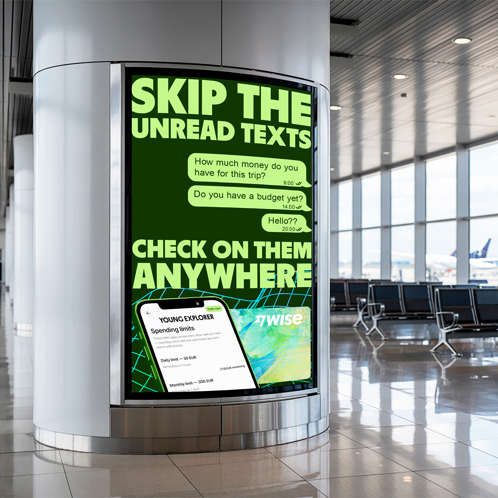
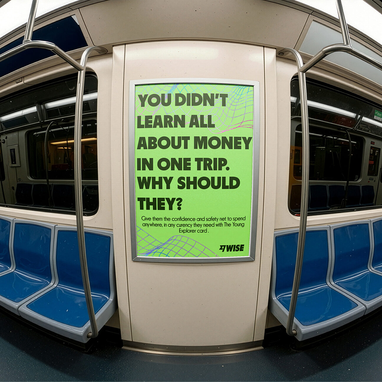
After speaking to both teens and their guardians, this much is obvious: everyone feels unprepared, but no one wants to talk about it.
Teens told us.
Parents:
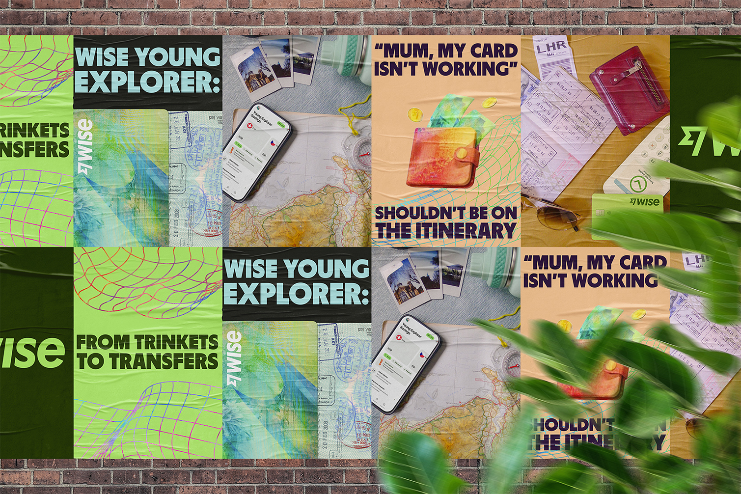
The solution? Put parents back in the pilot’s seat. No one knows their child better, and these kinds of conversations need to come from someone trusted. The safety net campaign is meant to prompt parents into action. We want to show parents that the Young Explorers card can be a tool to help them build that financial safety, without clipping their teens’ wings.
From our research, both groups want the same thing: safe travels. Parents want the comfort of knowing, while teens want the freedom to learn, fail and try, but that conversation needs to start with them.

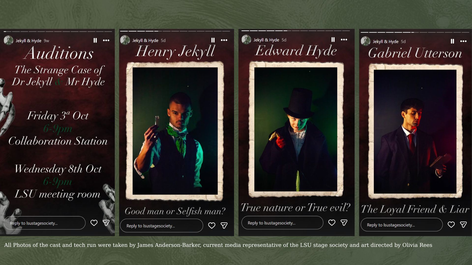
In October 2025, I was set to direct my own original adaptation of the 1886 classic horror novel “Dr Jekyll& Mr Hyde,” written by Robert Louis Stevenson. The show needed to be advertised to attract people, both locals and students, to come and watch, while avoiding common misconceptions about the classic story.
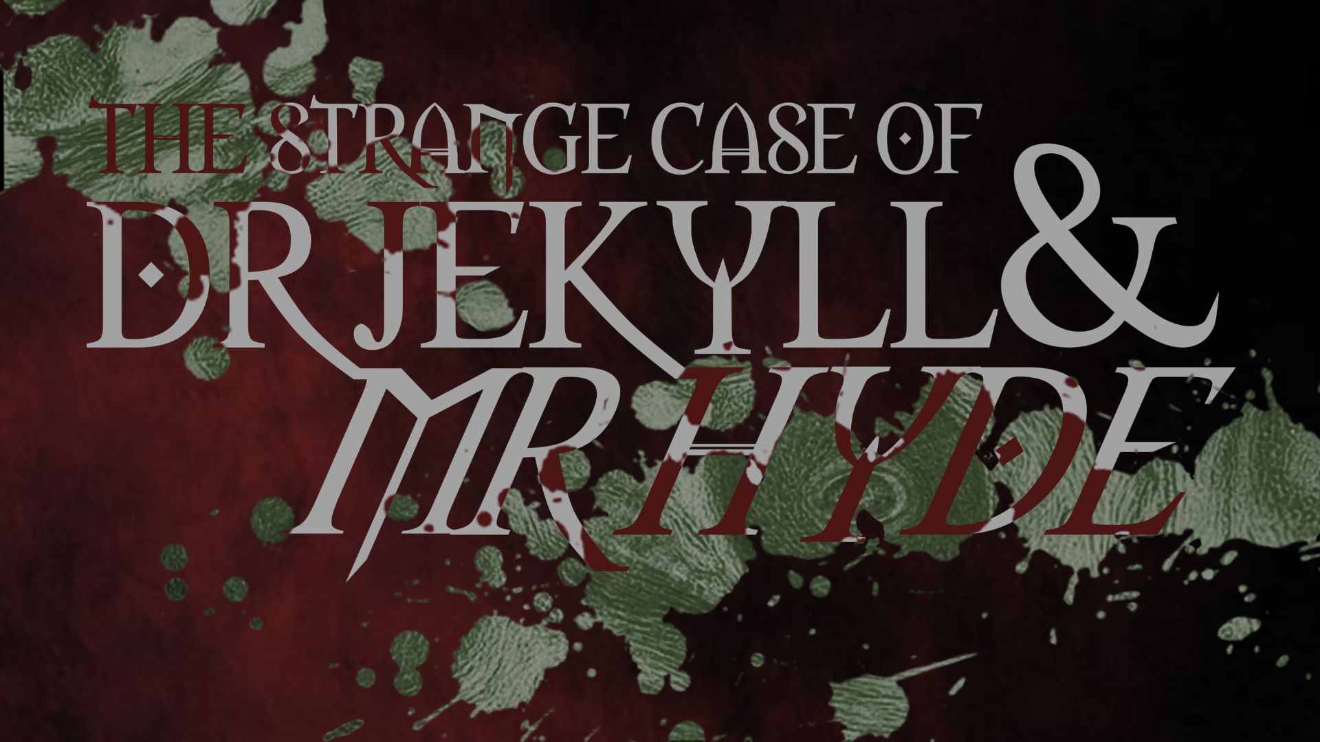
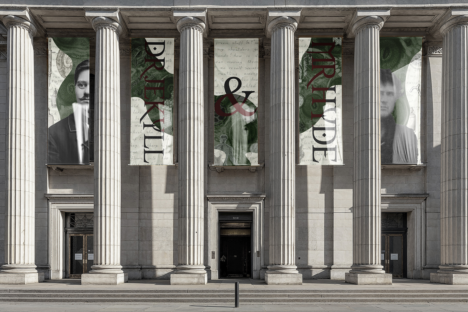
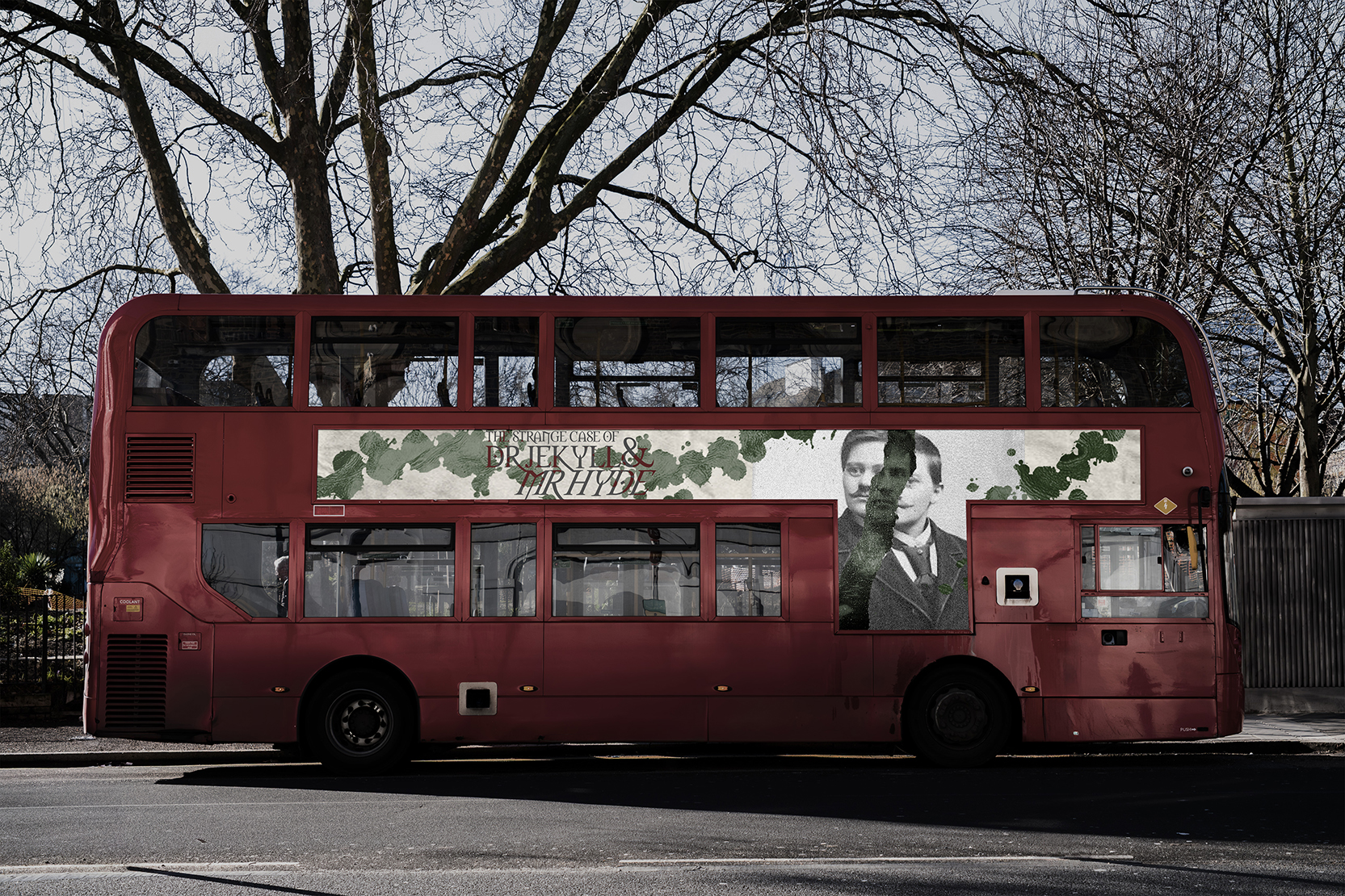
The target audience for this project comprises adults and older adolescents (aged 16 and above) with an interest in classic literature, particularly within the mystery and gothic genres. It is directed to people who seek bold, immersive theatre that challenges as much as it entertains. It is especially targeted towards enjoyers of the book who want to see a faithful yet reimagined adaptation.
Reimagined as a murder trial, The Strange Case of Dr Jekyll and Mr Hyde tells a story of shame and Jekyll’s relationship with morals. With the audience acting as the jury, this tale slowly unravels its mystery: What is happening to the upstanding yet unstable Dr Jekyll? Why is he protecting someone at the expense of his own demise? And more importantly, who exactly is the mysterious Mr Hyde?
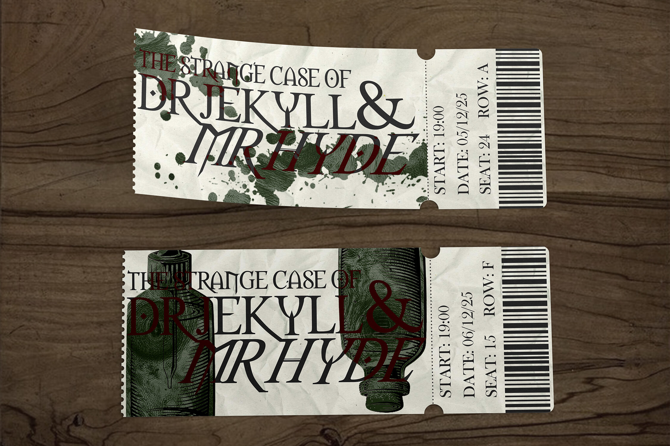
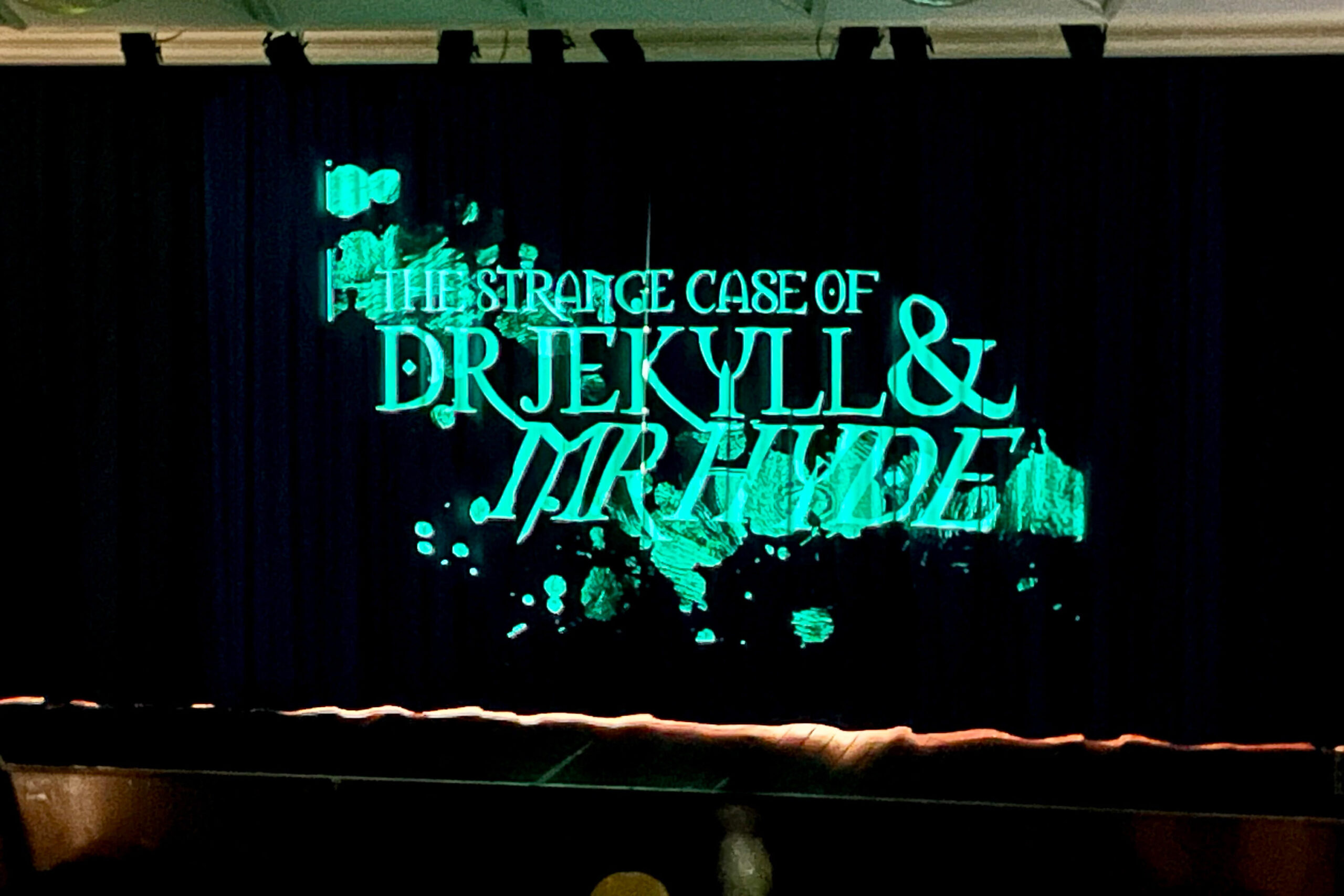
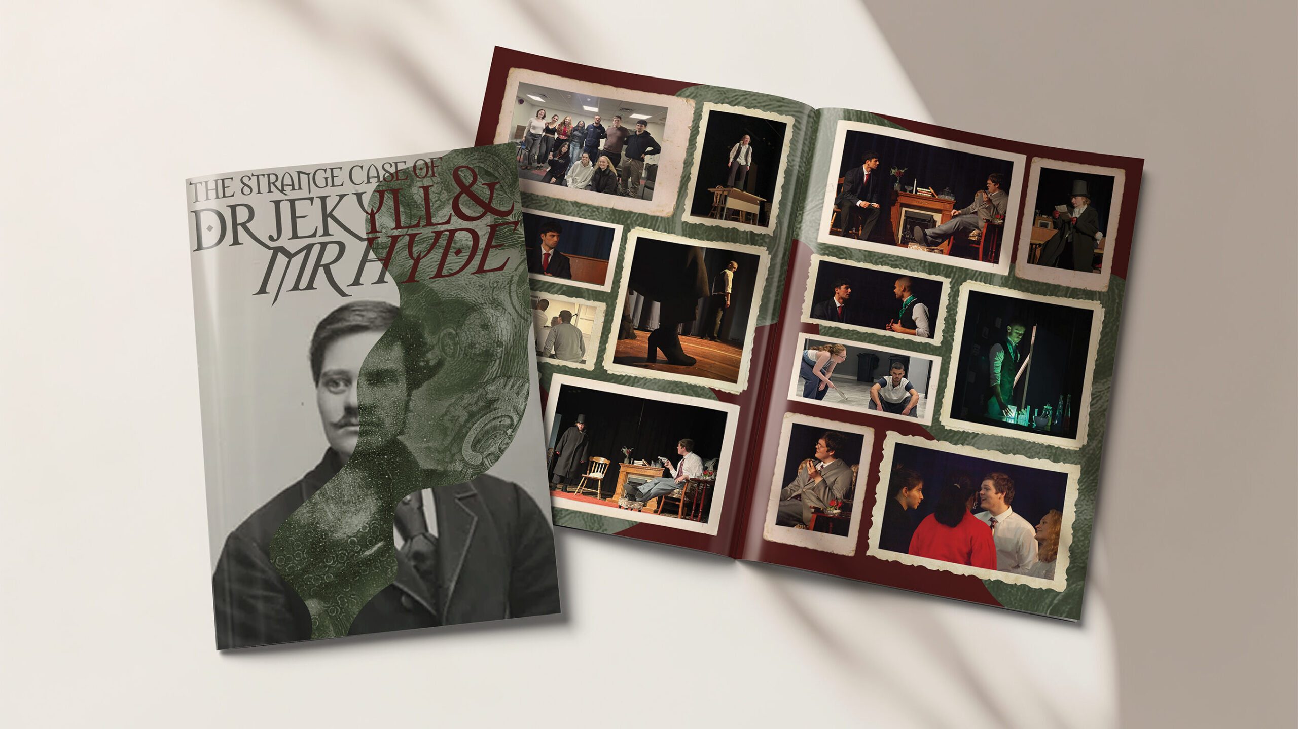
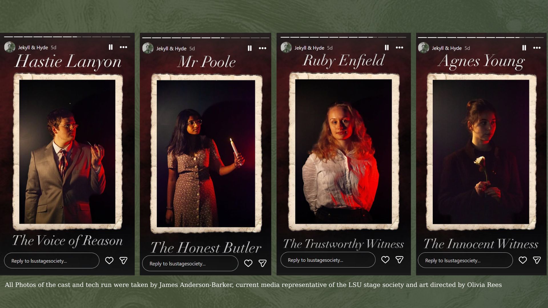
To create a simple and clear design identity that leaned into the gothic and medical reputation of the original source material. These designs had to be professional and eye-catching while still being adaptable to real-life, lower-budget university production. To promote the show, I had to make one clear poster, one printable programme and multiple Instagram posts introducing the cast and characters.